Understanding the Challenge
The Core-UI Design System
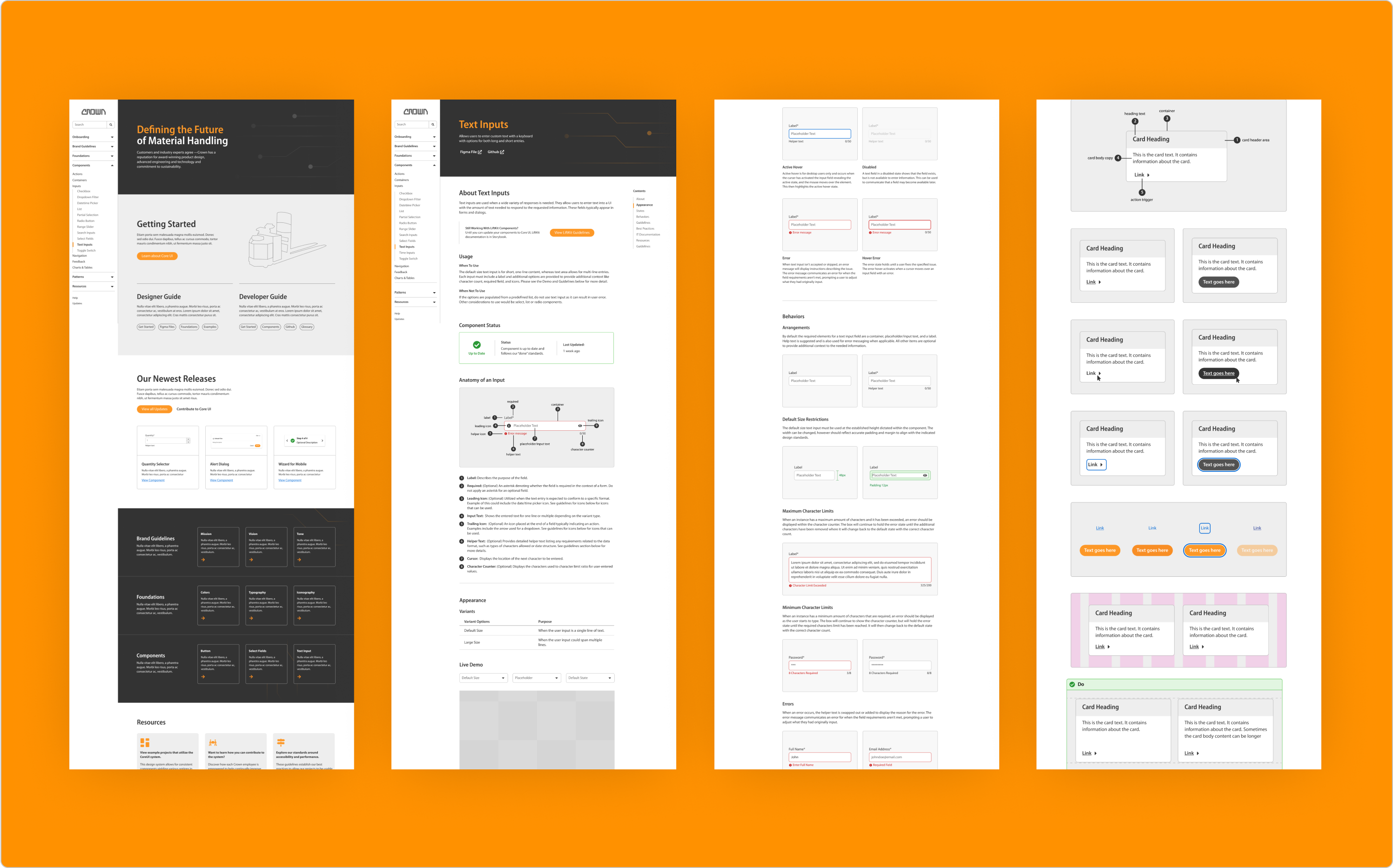
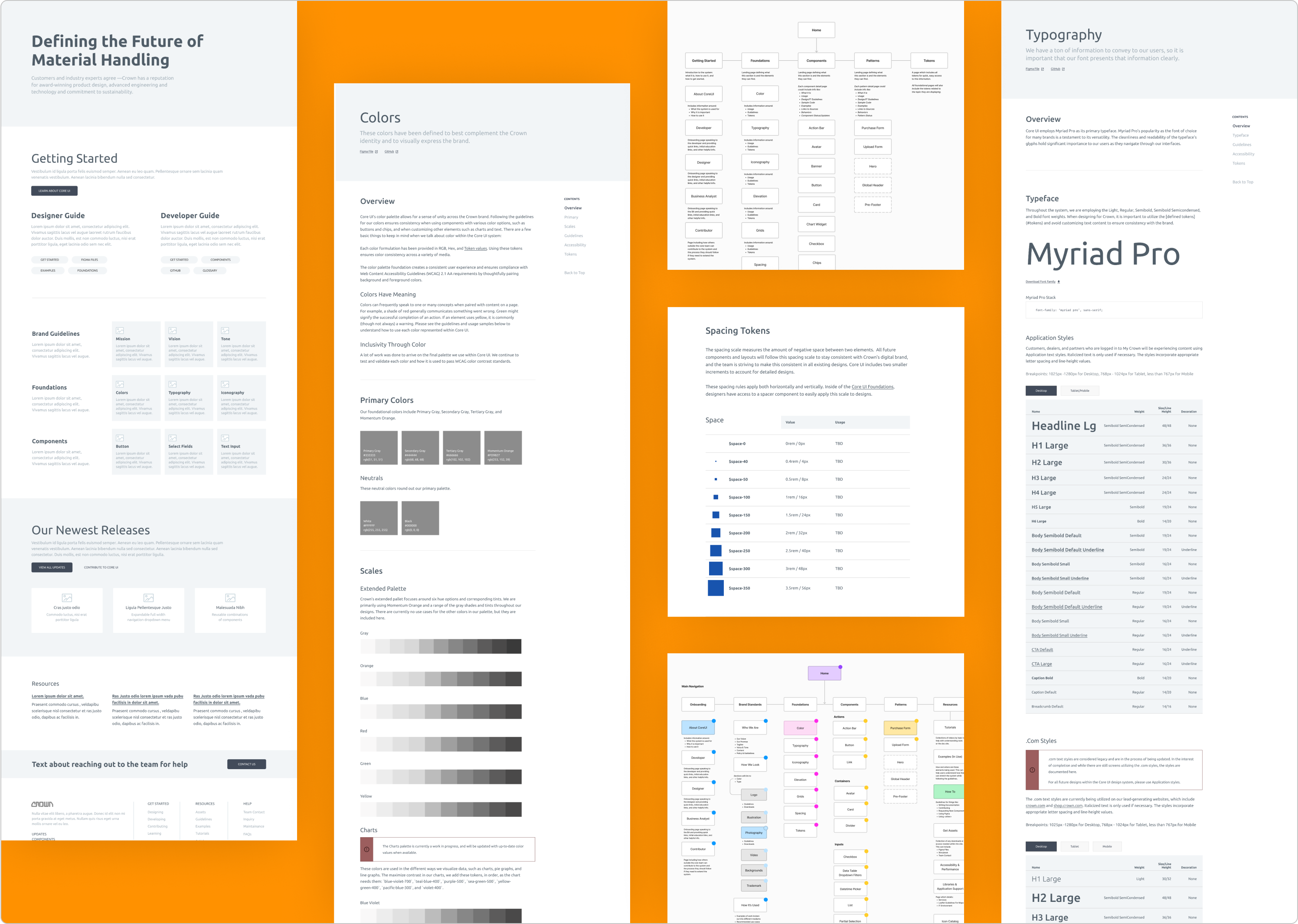
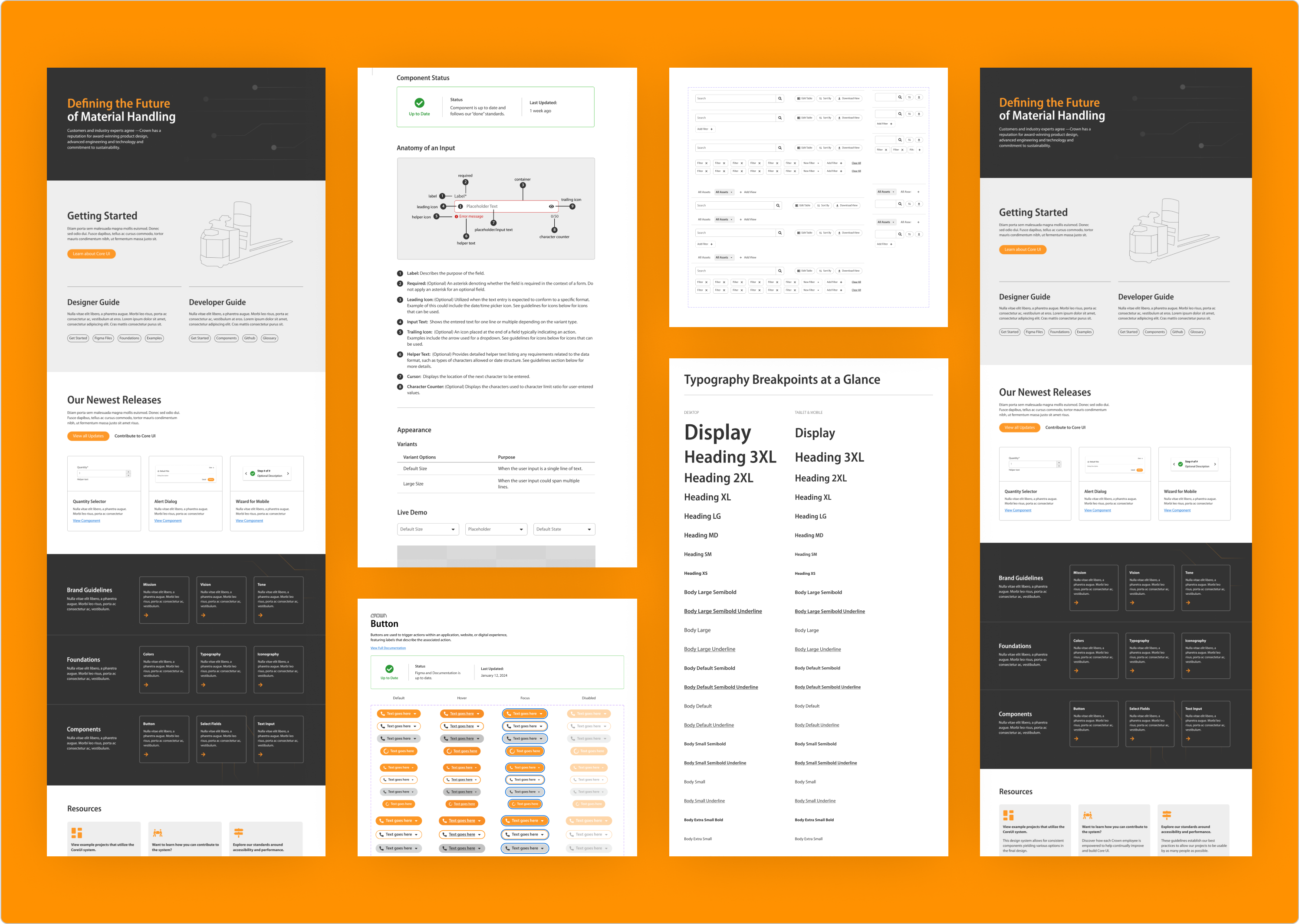
Crown’s design system, Core-UI, was already in use, but it lived across multiple tools, Sketch for design assets and InVision for documentation. This created friction: files were fragmented, updates were difficult to track, and collaboration between designers and developers was limited.
Our Primary Goals
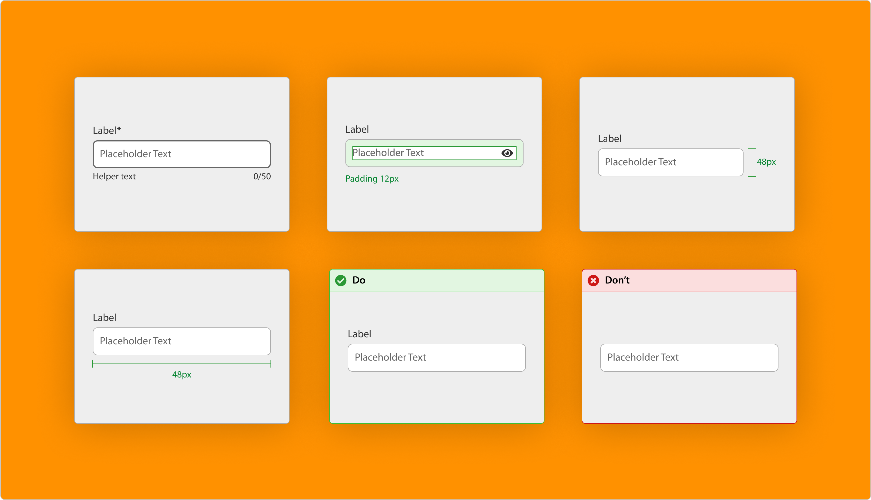
For this engagement, we had two main priorities. The first was migrating Core-UI into Figma. That meant more than just moving files over, we manually rebuilt components from Sketch, improving them as we went. In a short amount of time, we audited and documented the library, re-created components in Figma, and centralized everything into one source of truth to support faster, more consistent design work.
The second was laying the foundation for a documentation site. We defined the site’s structure and design, connected it to the Figma API to keep content current, and shaped it into a space where designers and developers could collaborate and share guidance.
Together, these efforts began to shift Core-UI from a simple component library into a scalable system, one designed to support consistency, accessibility, and flexibility while equipping Crown’s digital product teams for success now and in the future.