.png)
Laying the Foundations
Visual Exploration & Theme Selection
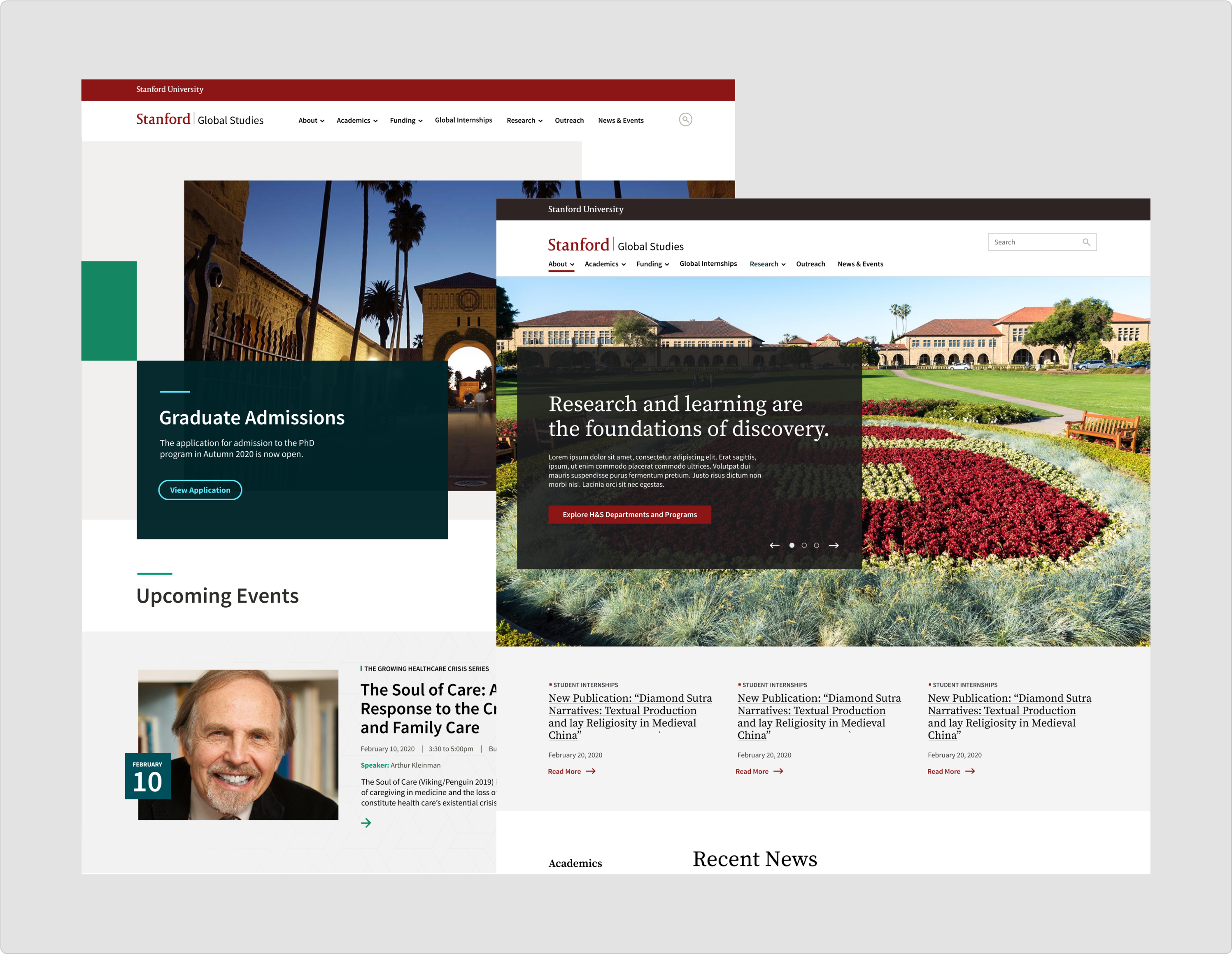
We kicked off the design process by collaborating with Stanford H&S on element collages to explore visual direction. Early conversations helped align everyone on key theme qualities, such as whether the look should lean bold and colorful or remain more traditional. Three themes were presented, but H&S chose to move forward with two parent themes: Colorful and Bold, and Traditional.
Establishing Our Foundations
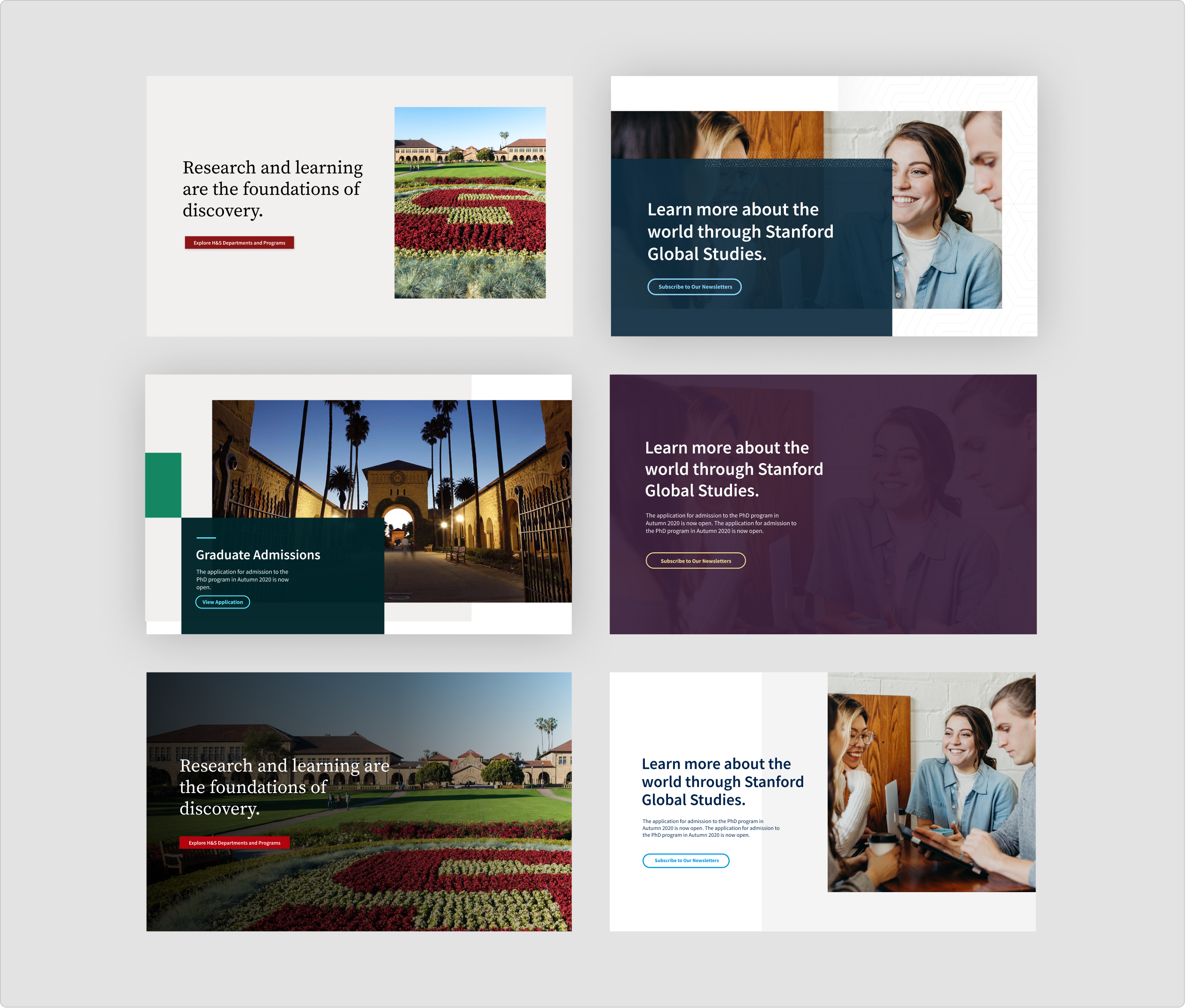
With the visual direction in place, we moved into setting up our design foundations in Figma. This step laid the groundwork for efficient and consistent component creation across themes. We defined key styles, such as color palettes, typography scales, spacing systems, and grids that would serve as the building blocks for every component to come. Establishing these foundations early ensured visual consistency and streamlined the design process as we moved into more detailed UI work.